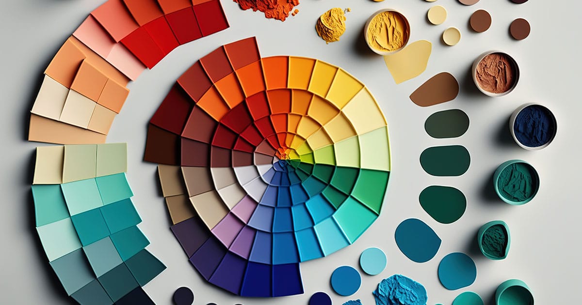
Color is an inherent part of our lives. We use color to communicate, express our emotions, and make decisions every day. As a designer, understanding color and its impact is critical to your success. Color theory is more than just knowing what colors look good together. It’s an essential part of effective design. This blog post will explore why color theory is so crucial and how designers can use it to their advantage.
1. Color evokes emotions
Color has a significant impact on our emotions and can influence the way we feel. Warm colors, such as red, orange, and yellow, are often associated with excitement, passion, and happiness. Cooler colors, such as blue and green, evoke feelings of calm and serenity. As designers, we can use this knowledge to create specific moods and emotions with our color choices. For example, a children’s website may use bright primary colors to signify playfulness and fun, while a financial institution may use blue to establish trust and dependability.
2. Color can communicate meaning
Colors have cultural connotations, and they can be used to communicate meaning beyond their emotional impact. For example, red is often associated with danger, while green indicates safety and go-ahead. As designers, we must be aware of the cultural and social implications of the colors we use. We wouldn’t want to use a color that is seen as offensive or insensitive in a particular context.
3. Color can improve functionality
Choosing the right colors can also impact the functionality of a design. For example, contrast is essential for legibility and readability, particularly for people with visual impairments. Accessibility guidelines recommend a minimum contrast ratio between text and background colors for readability. Additionally, using color strategically can help guide users’ attention to specific elements or actions on a page.
4. Color can influence user behavior
Color can also influence user behavior, particularly in the realm of marketing and advertising. In fact, studies have shown that color can impact people’s purchasing decisions. For example, blue and green are common colors used in eco-friendly products, signifying environmental responsibility, and can influence buying decisions for consumers who are concerned with sustainability. Color psychology is a powerful tool to influence user behavior and can be used to create effective branding strategies and marketing campaigns.
5. Consistency is key
Ultimately, the most crucial aspect of color theory is consistency. Establishing a color palette that reflects brand values and is consistently used across all touchpoints can help establish brand recognition and trust with users. Additionally, consistency helps create a cohesive user experience and can improve overall usability.
Color theory is an essential part of any designer’s toolbox. From evoking emotions to improving functionality, the impact of color cannot be ignored. Understanding color theory will help designers create effective user experiences and communicate their message clearly. By being aware of the cultural and social connotations of color, designers can make informed choices that resonate with their intended audience. Establishing a consistent color palette will help build brand recognition and trust with users. So whether you’re designing for web, print, or any other media, remembering the importance of color theory is key to success.